Stanfield Property Partners rebranding
Project summary
Client
Stanfield Property Partners
Industry
real estate consultancy
Before & after

Before
The old logo was too cluttered and poorly laid out. It felt like three or more logos merged into one.
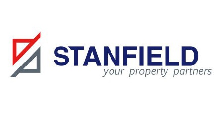
After
The new design got rid of the clutter and presented the logo in a clean, neat and meaningful way.
The new look
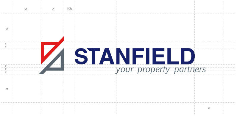
The logo is made up of three elements:
- The icon
- The logotype
- The tagline
The icon is made up of the letters S and P - the S is suggested by the negative space of the icon and the P is visible as the second half of the icon.
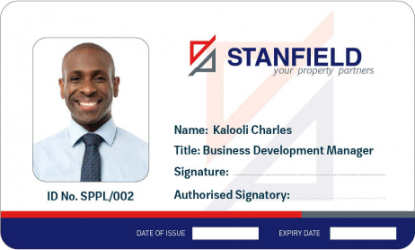
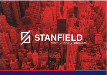
Designed templates